
If you're not fimiliar with Components and Custom Properties Check out
My Previous Blog On How to Create a Custom TextInput Component in PowerApps
Overview
In this blog im gonna explain how to build a reusable custom text input component with some advanced properties and functionality.
Requirements
Blog:
Custom Connector
Were gonna use the component from My Previous Blog and make some enhancements in it.
Lets Start from where we left.
Step 1:
Were gonna add some Properties
1: Select the Component.
2: On the right side of your screen you can see Custom Properties
3: Add a new custom property
4: Name the Property "Text"
5: Be sure to set the Data type to "Text" and Property Type to Output

6: Click on Save and a custom property will appear on your Component Properties
Step 2:
1: Select the component and go to its Properties. You'll see a new Property called "Text"
2: Set the Text Property to your textinputname.Text
In my case Textinput2.Text
Now you can get the text present in TextInput inside of the Compnent from anywhere in the app by just using YourComponentName.Text.
In my case Component1.Text

Step 3:
Add another Custom Property
1: Set its Name to "HintText"
2: Make sure its Data Type is "Text"
3: Set its Property type to "Input"

4: Click on Create
Step 4:
Add another Custom Property
1: Set its name to "Icon"
2: Set its property type to "Input"
3: Make sure its data type is "Text"

Step 5:
Add another Custom Property
1: Set its name to "IconAlign"
2: Set the data type to "Text"
3: Set the property type to "Input"

4: Click on Create
Step 6:
Insert an icon inside the Component
Insert > Icon > Select Any
Change its Color to White
Place it in center of the design

Select the icon and go to its X property and Type in the following Formula:
If(YourComponentName.IconAlign = "left", 20, Parent.Width-Self.Width-20)
Now Make sure the icon is selected and change its Icon Property to the following:
YourComponentName.Icon
Step 7:
Select the TextInput Control inside the component
Change its PaddingLeft Property to the following:
If(Component1.IconAlign ="left", 80,10)

Step 8:
Lets add a little Touch to our Design,
Select the HTML Text inside the app
Change its HtmlText Property to the following:
"<div style='width: "& Parent.Width - 30 &"px;height: "& Parent.Height - 30 &"px;
border-radius: 10px;
border-bottom:4px solid white;
margin-left:15px;
margin-top:10px;
box-shadow: 0 4px 8px 0 rgba(0, 0, 0, 0.2), 0 6px 20px 0 rgba(0, 0, 0, 0.19);
background: radial-gradient(ellipse at top, #77A1D3, transparent) 40%,
radial-gradient(circle at center, #076585, transparent) 40%,
radial-gradient(ellipse at bottom, #77A1D3, transparent)40%;
'></div>"
Note: This will add a shadow and a bottom border to the design
Step 8:
Time to integrate the component in our app
Now Go ahead and insert your component inside the App and Lets check our porperties
In the Tree View Select the Screen in which you want to insert your component.
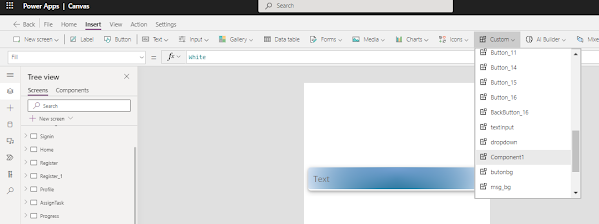
Go to Insert > Components> Select YourComponentName
Step 9:
Change the Icon Property to "Icon.Search"
Change the IconAlign Property to "left"
Change the HintText Property to "Search"

Now keep try and change the IconAlign Property to "right" and see the difference
You can change the icon, alignment and Hint text according to your need.
This Component can now be used almost everywhere, use it for search or email, password login whatever you require. simply change the Properties.
Note: You can get the text inside the Component by the following code:
"YourComponentName.Text"
I hope you found this Blog useful. Be sure to subscribe to get updated on new Blogs.
Feel free to ask questions and give suggestions in the comment box down below:
Comments
Post a Comment